OR DRUK
MEME
A handmade energy snack brand rooted in family, tradition, and nostalgic flavors.
The ingredients tells a story by highlights the nutritional benefits, and the goal is to give them a visual stage that feels authentic, tasty, and full of life.
The design refreshes Mama’s identity, connecting memory with modernity to reach a broader, younger audience.
VISUAL IDENTITY | PACKAGING | PRINT
This project was created as part of my work at Studio Nerubay
A handmade energy snack brand rooted in family, tradition, and nostalgic flavors.
The ingredients tells a story by highlights the nutritional benefits, and the goal is to give them a visual stage that feels authentic, tasty, and full of life.
The design refreshes Mama’s identity, connecting memory with modernity to reach a broader, younger audience.
VISUAL IDENTITY | PACKAGING | PRINT
This project was created as part of my work at Studio Nerubay
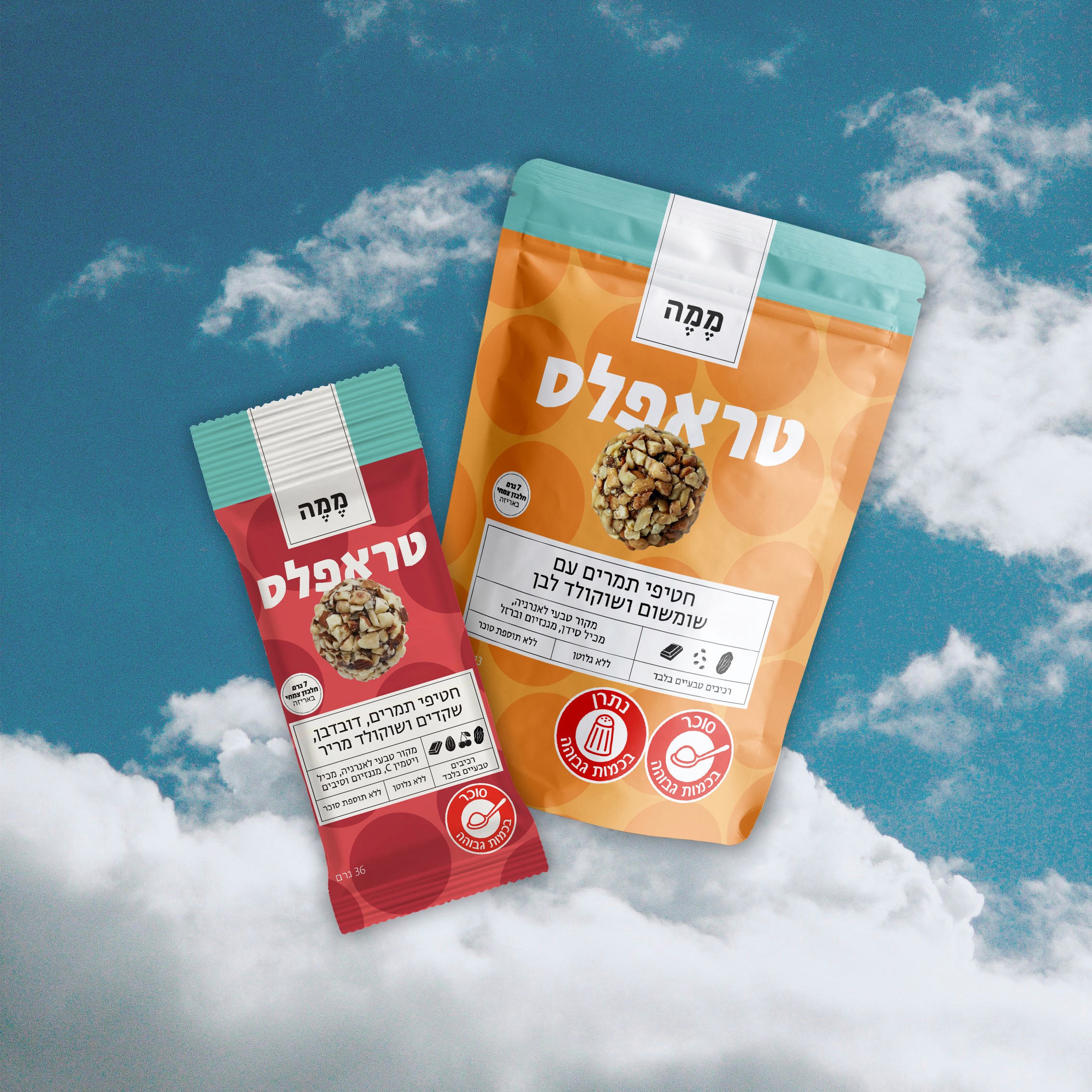

The identity was built around the ingredients themselves, using their
colors, textures and forms as an expressive part of the brand.
The identity was built around the
ingredients themselves, using their
colors, textures and forms as an
expressive part of the brand.


Each ingredient was given a visual stage that highlights both
its character and nutritional benefits, creating a direct
connection between what you see and what you eat.
Each ingredient was given a visual stage
hat highlights both its character and
nutritional benefits, creating a direct
connection between what you
see and what you eat.


NEXT PROJECT